Thursday, December 15, 2011

New Year, New Look

Well, its been close to two years since I first put my site and this blog on the internet. Back then, I was trying to figure out my "artistic identity" and came up with this:


I was looking to follow a very Bahaus design to go for a clean, modern look that would could be seen as "professional". I wanted it to come across as simple and legible in contrast to my often eidetic art work.

Well know that I've had at least two years of "real world" experience, I think I have a slightly better idea of my artistic identity than I did while I was in school.

Looking back this logo has a lot of things that don't work. The whole "Erik with a K" bit. Sure its funny, and memorable and a real pet peeve of mine when even my close friends can't spell it right, but if a client  doesn't notice just one letter in my name, than we probably aren't meant for each other, especially given the amount of small details in my illustrations. Much think the "I'm from Michigan *points to hand*" bit, it works better when spoken rather than written. Making the K red and than adding "with a K" under it is just redundant.

Confining my first name to a box was another bad move, as it divides my name and disrupts legibility. Not that all capital letters really helps with clarity either. The small addition of "illustrator" feels very much like an afterthought.

So I've been tinkering with a few ideas and came up with this:

Upon a review of my portfolio I realized just how much humor is a part of my work and wanted to reflect that in my new logo. The font for my name is called "Thingamajig", which is probably best known as the font for the Fantastic Four logo, reflecting my comic book roots. Its a very bouncy font, which ties into my "obtuse" sense of humor and has a very "hand drawn" look to it, not unlike the bold brush strokes of my illustrations.

Beneath that is "Illustrator" is Futura, which is a modern, more professional, slightly retro font, representing the foundation in traditional artistry that supports my often goofy exterior.

I'd be very interesting it reading what you think of this change. Please let me know.

Friday, December 9, 2011

SleepCare Seasonal Serial Part 4: Skinny Santa


The epic conclusion! Thanks to Santa's CPAP machine, not only does he get plenty of rest, but he also manages to lose a lot of weight, and is more active and awake during his late night job. Merry Christmas to all, and to all a good night's sleep!

SleepCare Seasonal Serial Part 3: Santa CPAP


Santa Claus receives the gift of a CPAP Machine to help his night time breathing and make sure he and the Mrs sleep soundly.

SleepCare Seasonal Serial Part 2: Santa Snooze


Uh-Oh! It seems Santa's sleep problems have become a disruption on day-to-day operations at the North Pole.

Seeing Santa sleeping on the job is no stranger to illustration.

Heres a famous example by Norman Rockwell:


And here's a less famous depiction from James Williamson (image courtesy of Today's Inspiration)


SleepCare Seasonal Serial Part 1: Santa Snores

Sleep Care provided me with an interesting challenge to cap off the end of 2011. My editor suggested a series of illustrations that would run weekly through the month of December chronicling Santa Claus overcoming his sleep disorders such as snoring and narcolepsy. I was fed this idea just before Thanksgiving, which also had a tie in illustration that would need to be done in record time. Then I was told these Christmas illustrations would be in full color.

Anyway, it was a close call, but I managed to finish them. I just wish that SleepCare had taken the same approach as the Salvation Army with their Christmas illustrations and asked me draw Christmas over the summer so I would have had more time, but what can you do? Heres hoping for an extra little stocking stuffer along with my next paycheck.

Anyway, here's part one:


I knew that somewhere along the line I'd have to do an illustration of distruptive snoring, so I had a file of reference photos ready. Problem was I didn't expect the party in question to be such a large iconic figure, so it took some tinkering with the composition to make sure Santa was identifiable. 

It appears Santa's holly jolly snoring has caused Mrs. Claus to break out the tarmac earmuffs.


Tuesday, November 22, 2011

Tryptophan Thanksgiving


SleepCare gave me quite the challenge with a series of holiday related illustrations just  shy of two weeks before Thanksgiving. I cranked this one out quickly so that it could be on the site and have a least a weeks worth of relevance, and hopefully buy me some time to work on the Christmas illustrations.

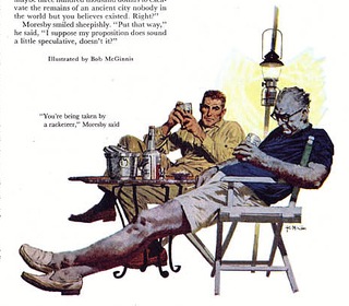
I don't know why this woman is so thankful for Tryptophan. It this means is that she'll be the one doing all the dishes while everyone else is snoozing. I've been told that the man in the foreground bears a slight resemblance to myself. There might not have been so much similarity if not for the glasses, which I only added because of a Robert McGinnis painting that stuck in my mind while I was searching through my inspirational swipe files for people asleep in chairs.


Have a great Thanksgiving and if you can, use the time off to catch up on some sleep.

Sunday, November 13, 2011

Sunday Sketches

Earlier this week I started work on a new illustration for SleepCare involving people sitting at a dinner table and I spent most of the weekend sketching how make a sitting scene look dynamic, or at the very least... interesting.

So when I was asked by some friends if I wanted to have lunch with them at the mall food court this afternoon, I just couldn't help but observe how people sat casually in chairs and just how different it was from the reference photos I was looking at over the weekend were people were posed in chairs.

Gesture drawings are something I've kind of slumped on the past year now that I'm out of school so spontaneous sketches like these taken from outside the home, especially fast and with a pen felt like a breath of fresh air and quite a rewarding experience. I wondered why I didn't do this more often, and then I had to get gas for my car and one glimpse of those prices reminded me why I don't get out much.

Self Portrait


I drew a new self portrait to replace the old photo I used to use which didn't feature my face fuzz. Also, I've been making a lot of changes to my web site recently and wanted to have my picture be on the first page. Lacking any quality photos, I drew myself at my best. I don't smile that often, so I had my webcam take pictures of me while I was watching cartoons on YouTube. Even when cracking up, my mouth really doesn't open that wide, and my teeth seem to serve as sentry, guarding my tongue and tonsils from any outside influence.

Saturday, October 15, 2011

Who's on your bookshelf?

I remember during my freshmen year of college I always got asked that irritating question thats become so ingrained with hipster culture: Who is on your iPod/ mp3 player/ CD Player?

Its a question that never made much sense to me being at art school, were you'd think people would be more inclined to ask what kind of visual artists influence you, or at the very least ask you what your major is or what you like to draw and with what tools. But, no.

Another college memory was of my friend Chema, who frequently spoke about wanting to have a library of her own, to just sit in a room surrounded by books. I don't know about you, but that just sounds awesome!

After bringing home some treasures from yesterday's Library Book Sale, I thought I would show off what I've got and maybe give you just a little bit of a hint of what I like and what inspires me.


Here's a shot of my main bookshelf. Its about six feet tall. I have plenty of other books that I keep on a smaller shelves closer to my bed and my chair, but these are the heavy hitters that I use the most frequently in my art.


Starting from the top left: The first four volumes of Bone, a collection of Mutts comics and the Complete Calvin and Hobbes collection. All paperback collections of the strip plus the Lazy Sunday Book, Tenth Anniversary Book and the Sunday Page exhibit book with the original pencil sketches, that one was quite the find!


Watchmen and Norman Rockwell's autobiography are a bit out of place on this particular shelf, but because I have so many books I have them organized by height and weight. More comics with five volumes of Zits plus the old Superman newspaper comic strips.


Mixed bag at the end with some books about the behind the scenes aspects of art and illustration and a handful of children's books that have beautiful illustrations.


Mythological Creatures. Every bookshelf needs at least one field guide.


On the far left you'll see my copy of the MST3K Colossal Episode Guide in order to help keep my snarky comebacks fresh.

Then theres my collection of comics trade paperbacks. Its a mix of material I've bought online and stuff I've dug up at used bookstores. All good finds as far as I'm concerned.

At the end: James Gurney's Dinotopia series. I actually met him at a museum tour back in high school were I told him I was interested in becoming an artist. He signed the inside cover with a note "To Erik, Fellow Artist" and then drew a little Stegosaurus (my favorite dinosaur!) He came to my college as part of another tour four years later were I was able to show him the autographed book and thank him for his encouragement.


A couple of more illustrated children's books, Ian Thorne's Crestwood House Monster Series. I kid you not, I found these books at Library Book Sale just a day after James Rolfe posted his retrospective on the series. Talk about timing. Also, the Pultizer winning Maus graphic novel.


A couple of other odds and ends. The Making of a Charlie Brown Christmas, a number of other illustrated books, including Howard Pyle's King Arthur and a collection of Edgar Allan Poe stories illustrated by Harry Clarke. Looking back I can't help but wonder if my interest in horror and detective stories as well as my preference for lots of heavy black lines in my art might have been due to subconscious influence that both Poe and I share the name "E. Allan". Hm...

Also, I'd be remiss if I didn't mention Little Whistle as it was a gift from the artist himself, Tim Bowers. Its the timeless tale of a guinea pig wearing a peacoat in a toy store.


Here we have several books on figure drawing...


Gradually shifting into books on drawing comics.


And this section is the "Art of" books. Illustrators on display include such giants as Alex Ross, Jeffery Jones, Everett Kinstler, Frank Frazetta, Franklin Booth, Drew Struzan, Edgar Degas, Norman Rockwell and an considerable wealth of vintage children's book illustrators.


My Will Eisner Shrine


My collection of Marvel Essentials. These were how I first got into comics, and I would highly recommend them to any interested in getting into comics now, especially to young readers. Each volume reprints about twenty issues of its series in chronological order, so you get the see how these classic characters got their starts and how they developed over time. While I bought these books secondhand, they were in decent shape to begin with but reading and re-reading the Fantastic Four books contributed to their worn appearance, and regardless I still get them out every once and a while because a lot of the stories still hold up.

What I don't get though, is why the X-Men volume's spine is printed the opposite way of the other books. The only way to read the title is if I store the book upside down. Weird.


My collection of Communication Arts Illustration Annuals. Generously given to me by Dan of Clear River Communications.


Couple other odds and ends. Burne Hogarth's Dynamic Anatomy, Dennis the Menace: Hank Ketcham's First Forty Years, Star Trek Sketchbook: The Art of the Original Series, now that was quite a find.
Animation Art, which was used as a text in my comics and cartoons history class in college. Then more comics: The Far Side and Foxtrot.


Various Volumes


A couple oversized hardcover "How To" drawing books, Fairburn System's Visual Reference Books, my oversized Comics History textbook and three volumes from the Directory of Illustration.

Wednesday, October 12, 2011

Can't Sleep


Not much to this one. The guy drinks too many energy drinks, gets the shakes and can't sleep. He can't figure out why, while his wife wonders just how big of an idiot he is.


Monday, October 10, 2011

Angel Tree Online

Well, talk about timing. No sooner to I mention the Angel Tree Illustrations, but I get a message letting me know they are now online.

Check it out! Click the screenshot for the link and navigate to "Host an Angel Tree".


Hover the mouse over each step to see the awesome addition of color. Its especially impressive for me since that one splash of color on a pen and ink drawing is exactly how the vintage magazine artists I look up to were originally published.


At the risk of sounding cliche, its almost as if Christmas has come early. 

Amy

In my last entry I said I was thankful to finally have back to back projects. Well, the projects just keep coming so I don't have much time in between to post so I thought I'd show you a preview of one of my more recent projects.

This is part of a series of portraits I'm doing for the Salvation Army, sort of a follow up to my Angel Tree Illustrations. Hopefully I'll be uploading so more sometime soon.


Well, I'd better get back to work.

Music to Draw By!

Saturday, October 1, 2011

Egyptian Exhibit

During the doldrums of the "waiting for phone or e-mail reply" stage of freelance illustration, I drove down the local museum's new exhibit on Egyptian artifacts, or rather replica's of Egyptian artifacts from King Tut's tomb.


Saturday, September 24, 2011

Operating Room


First the Straw Farmer, now this? It was surprising for me since I rarely get two different projects finished in under a week, though thats because I rarely have more than one project to work on at a time, but lately I've had a bunch of work heading my way. Thank God, its about time!

Anyway, I'm back to drawing illustrations for SleepCare. After the Sleepwalking Zombie and Dr Jekyll and Mr High, I decided I wanted to back off from the horror themed, because I felt the concept were starting to conceal what they were trying to convey, both were very crowded compositions, and I could tell that my editor was hesitant with such ideas. While I understand his reluctance to go fourth with my parody of "Alien" idea  ("Apnea", starring Sigourney Weezer) , I still protest that my idea of a vampire in his coffin scurrying away from shafts of light coming through a broken window would have been an absolutely perfect accompaniment to an article about the dangers of light in the bedroom when you're trying to sleep. Ah well.

So this is my attempt at getting back to basics, well as basic as I can get, since I seem to have once again gone overboard on excess details. Originally there was going to be an X-Ray machine in the on the left hand side, but I thought made the room look too cluttered and distracted from the snoozing surgeon and the perplexed patient.

The idea isn't too complex. Sleep Care says twelve hours hospital shifts are a bad idea, and the caption sums it up easily. Not much of punchline, but then again my editors typically long for something short and sweet, so there you have it.

Tuesday, September 20, 2011

Straw Farmer


My latest entry for Dow Goarden's card contest (much like last year's Waterfall and Piggy)

This card depicts a sculpture made of straw of a farmer raking straw.

Wednesday, August 31, 2011

Sneak Peek

The Return of Crown Jewel: The Empress of Awesome!

I've made quite a few changes to the appearance of her costume, and its colors since the last time I posted her here.


I think I've finally come up with a design were I find myself satisfied. Its definitely a more "balanced" composition than last time. Keep watch for some dynamic action poses to come!


Friday, August 26, 2011

Mural Ready for Monday

Well in addition to making touch ups on the spot illustrations for the Salvation Army project, I also went into school for one last round of touch ups on the mural before classes start up on Monday. Its taken about three weeks and approximately fifty hours worth of work. Most of that work was in layering. It took at least three or four coats of paint before it finally started to cover the foam background.

Here are some shots to give you an idea of the progress.


And here, at long last, is the final project installed in the classroom corner reading area.


And heres some pictures of me standing next to it for scale.


All and all, I'm satisfied with the results.

Heres a look back at how the whole thing started.

Angel Tree

Christmas came early for me when I was asked to provide spot illustrations for the Salvation Army's new  Angel Tree Project website. The images will coincide with instructional text telling people what to do to get involved with the program. I'll be sure and add the link when the site does go live.

It was a bit of a challenge for me, working into something that was already some and was then going to be reduced in size. So for inspiration I ended up looking at artists known for their line economy such as Hank Ketchum, Al Hirschfield and Earl Oliver Hurst.


Related Posts Plugin for WordPress, Blogger...