 |
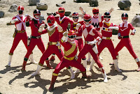
| Action Figures. 2013. Photoshop, 5 x 7 original. |
While I haven't produced many eerie illustrations for Halloween, I have been busy on some big projects! First up, this accompaniment for an editorial article for "Cool and Collected" magazine, a Kickstarter funded publication about vintage toys and other elements of collectable pop culture. The project still has a week to go at the time of this posting. Read more about it here!
The article itself is about repeat buying and variant collecting. Basically how collectors can get into the habit of purchasing toys based on all the alternative versions of a single character.
INSPIRATION:
In order to give the client an idea of the kind of vision I was shooting for in the finished piece, I created a collage of images that showcased a single character's diverse appearances over time.

SKETCHES:
My first idea involved a collector picking up a toy, only to discover that he is surrounded and overwhelmed my this action figure's relatives and predecessors. While this notion presented the sense of pressure with all the potential purchases weighing on his shoulders and some fun personality possibilities with each toy interacting with the buyer. However, both the client and myself were wary of putting a face to the toy collecting market so it was mutually decided to nix this one.
The second sketch reversed the original scenario. Turning the front figure around so that he is still confronted and burdened by all the different types of toys. This ended up being the design chosen by my client.
I put forth a third sketch of a high angle shot with the original doll mint-in-box surrounded by the successor toys, eliminating the collector character altogether.
PROCESS:
Originally this was just going to be black and white with some basic color thrown over top. But then I ran into trouble trying to depict different types of textures, both cloth and plastic, in such a graphical representation. Since I had a full two weeks to put this together (and was doing the piece pro-bono) it presented the opportunity to play with some Photoshop tools I had been wanting to tinker with but may not have had the time otherwise. I figure "I've got all this time, I may as well experiment and perhaps have a little bit of fun along the way."
Working in multiple layers with varying opacity was great for rendering this translucent clip-on armor
Working this way was something very new and different for me. I'm certain that it could get better and would be very interested in any comments on how I could build on this coloring crossroads for future pieces!


